KEEP IT SIMPLE
- GREGORY KREIDLER
- Jan 26
- 2 min read
TAKE MY ADVICE ON DESIGNING TEAM LOGOS AND CHOOSING UNIFORMS FOR YOUR BASEBALL TEAM OR SOFTBALL TEAM
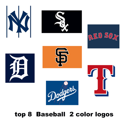
ONLY CHOOSE 3 COLORS AT THE MOST!!!!
If you’re in charge of picking out and designing uniforms for your baseball or softball team, let me offer one important piece of advice from someone who’s been designing baseball and softball logos and uniforms for more than 25 years: stick to three colors at most. Simple designs work better, look sharper, and stand the test of time.


First, three colors keep the uniform clean and visually appealing. Baseball and softball are fast-paced sports, and uniforms need to be easy on the eyes—for players, officials, and fans. When too many colors are used, the uniform can look cluttered or confusing. Instead of highlighting the team’s name or logo, extra colors compete for attention. With only three colors, each element has a purpose, and the overall design feels organized and intentional.
Three colors Pink-Black-Grey---- there is a little green in the logo but that doesn't confuse the formula.


Second, a limited color scheme strengthens team identity. Some of the most iconic teams in sports history are instantly recognizable because of their simple, consistent colors. When a team commits to three colors, those colors become part of its brand. Fans can spot the team from across the field or in the stands without even reading the logo. That kind of recognition builds pride and tradition, which are important at every level of the game—from youth leagues to professional teams.


Another important reason is versatility. Teams need multiple uniform versions: home, away, alternate jerseys, warm-ups, and sometimes special-event uniforms. When you only use three colors, it becomes much easier to mix and match while still keeping everything consistent. Every uniform feels like it belongs to the same team. With too many colors, alternates can quickly drift away from the original design and lose their connection to the team’s identity.


Cost and practicality also matter. Fewer colors usually mean lower production costs, especially for smaller programs or school teams. It’s easier to source matching fabrics, replace damaged gear, and keep colors consistent from season to season. This is especially important in softball and baseball, where uniforms take a beating from sliding, dirt, and frequent washing. Simpler designs age better and are easier to maintain.
PRICE LIST FOR PRINTING

Finally, three colors help the players themselves. Uniforms should make athletes feel confident, not distracted. When a design is simple and sharp, players can focus on the game instead of what they’re wearing. A clean, professional look can boost team confidence and make players feel united every time they step onto the field.


In the end, choosing only three colors isn’t a limitation—it’s a smart design strategy. It creates clear visuals, builds a strong identity, saves money, and helps players and fans connect to the team. In baseball and softball, where tradition and teamwork matter, sometimes less really is more. ⚾🥎

Greg from Splogoz


Comments